What have knowledge maps to do with statistical information from the past, recorded on lists while going from door to door back in the past and documented as tables in books for eternity? The Third Annual Meeting of the CEDAR project – one of my projects in Amsterdam – showed the different use of visualizations in the context of Digital Humanities research.
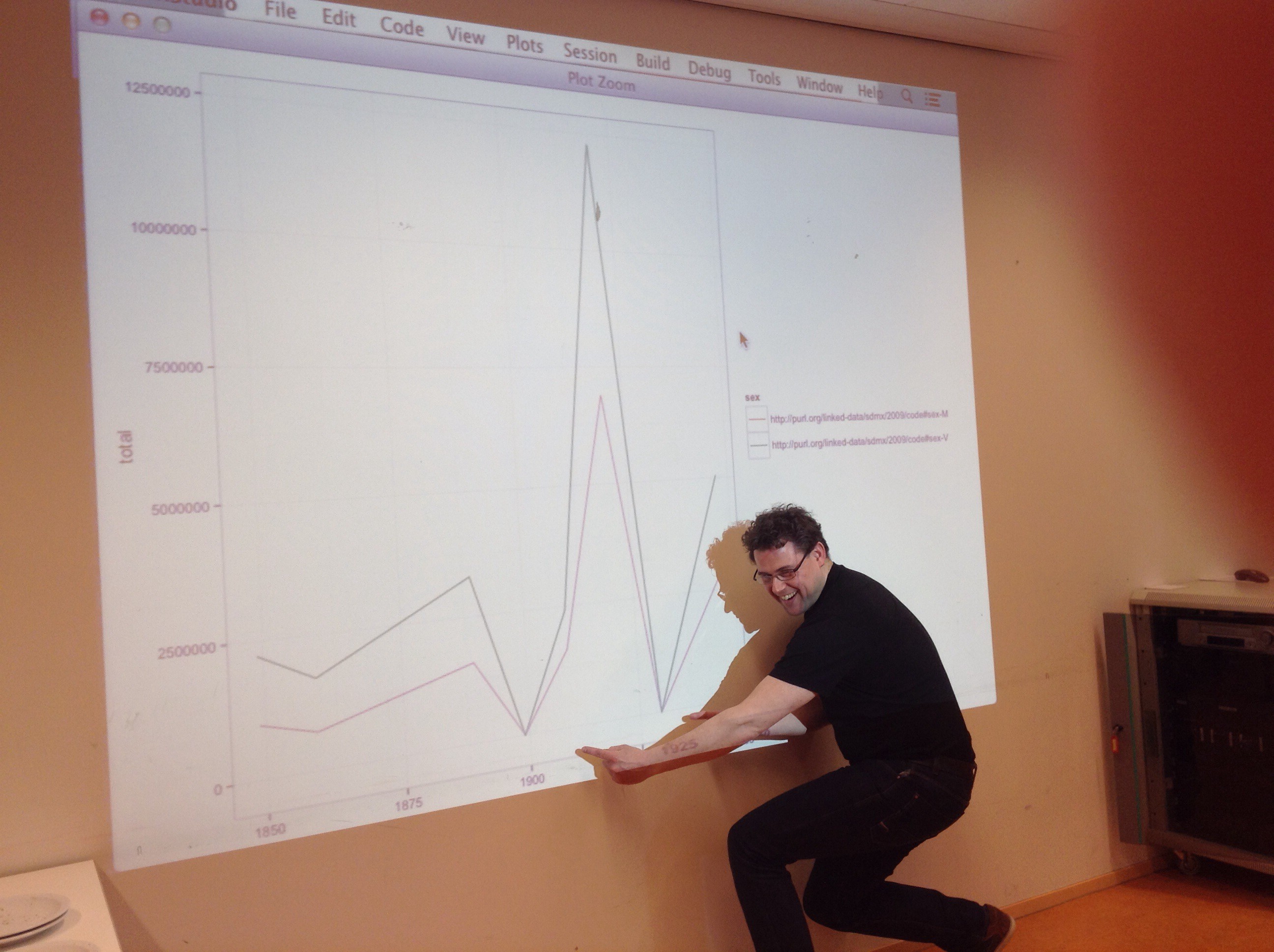
Maps can be used to get an overview, and insights in the complexity of variables to be found in census information. The size of the Dutch historic census changes over decades, visible in the amount of tables; and so do the kind of questions asked at that time. Statistics and its graphic representations give us an immediate impression of the complexity of information hidden in 200 years of census.
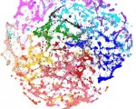
Visualizations can be used to help us – in the project team – and others to comprehend the complexity of sources and workflows we have to deal with. Here, the visualizations Sarven Capadisli uses are a good example how to communicate about complex projects.
Last but not least, the vision is to produce – automatic and elegant – visual insights in census data, for researchers as well as for the wider public.
All those aspects were discussed at the CEDAR annual meeting, about which a more detailed report can be read here: http://ehumanities.leasepress.com/emagazine-2/projects/cedar-third-annual-symposium/ This report also documents in which different ways funding from COST can be used in daily academic practices. Sarven stayed with us in Amsterdam via a STSM, and at the same time was one of the keynotes and active participants in the CEDAR symposium.
Andrea, April 2014
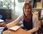
PS: The photo shows Richard Zijdeman from the IISH during the inspiring hackaton (day 2 of the meeting).